It’s always a treat to spot our brides and grooms on the pages of Martha Stewart Weddings! Kate and Nick worked with the team at our flagship store to customize our Deveril invitations for their July wedding on Fishers Island. Hand calligraphy accents by Sarah Hanna and a custom map of the island (printed on the backside of the invitations) added a personal touch to their classic letterpress wedding invitations. The bride and groom opted to print a combination website + RSVP card, and received the most creative and fun responses from their guests – including poems and videos! Take a peek at some of their wedding details below, or visit Martha Stewart Weddings to see more photos!


With the help of the expert associates at our flagship store in Manhattan, Allison and Michael transformed our Woodland design into rustic summer wedding invitations for their New York City nuptials. They changed the orientation, softened the color palette and added design elements from other pieces throughout the Woodland suite to further personalize their stationery. A custom map helped out of town guests navigate the big city and a jute pocketfold helped keep all of the particulars in order. We digitally addressed their jute envelopes in navy to coordinate with their navy envelope liner, too!


letterpress ink: navy | foil stamping: rose gold shine | fonts: salzberg + henry | paper: bella cotton white 1-ply + 2-ply | pocketfold: jute | envelope: jute | liner: classic color pattern in navy | digital envelope addressing: navy | Bella Figura NYC | customization #32411
Gisselle and Thomas worked with our friends at The Windmill Paper Boutique to transform our Vessa design into orchid wedding invitations for their Coral Gables nuptials. They added romantic flourishes from our library to the invitation and reception card and included a map on the backside of the accommodations card to help guests navigate between the church, the venue and recommended hotels. To keep all of the enclosure cards organized they included a pocketfold, foil stamped on our metallic white gold paper in an orchid pattern from our library.


letterpress ink: charcoal | foil stamping: gold matte | fonts: aiden + poetica + vessa | paper: bella cotton ivory 1-ply | diecut style: charleston | pocketfold: metallic white gold with gold matte foil stamping | The Windmill Paper Boutique | customization #30976
The foil and letterpress save the dates that Iva and Christopher chose for their Toronto wedding showcased how beautifully the two printing methods can compliment one another when used together. Formal typography inspired by our Classic Manhattan design was printed in silver shine foil while a vintage map of Toronto was letterpress printed in pale gray ink.


letterpress ink: pale gray | foil stamping: silver shine | fonts: grace + jubilant | paper: bella cotton white 1-ply | Paper & Poste | customization #25388
We sure do love shiny foil and colorful embellishments – but sometimes the simplicity of crisp black letterpress ink against the pillowy backdrop of our cotton paper is enough to take our breath away. Silvia and Jesse’s Hayden calligraphy wedding invitations showcase the beauty and craftsmanship in both hand lettering and artisan printing, with Nicole Black’s calligraphy calling guests to their California winery wedding.


letterpress ink: black | paper: bella cotton white 1-ply + 2-ply | hand calligraphy style: hayden | customization #24259
Jessica and Cameron were inspired by a vintage flyer when customizing our retro-cool Tara wedding invitation design for their autumn garden wedding. They added Gold Matte foil and more vintage design elements along with their own very personalized wording. To make sure guests had all the details, a double-sided direction/map card, accommodations card and brunch card were included.

letterpress inks: pool + espresso | foil stamping: gold matte | fonts: moravia + billhead + knockout + pyramid | paper: bella cotton 2-ply ivory | foil edging: gold matte | envelope: bella cotton ivory | envelope liner: european formal pattern in pool ink | customization #19205
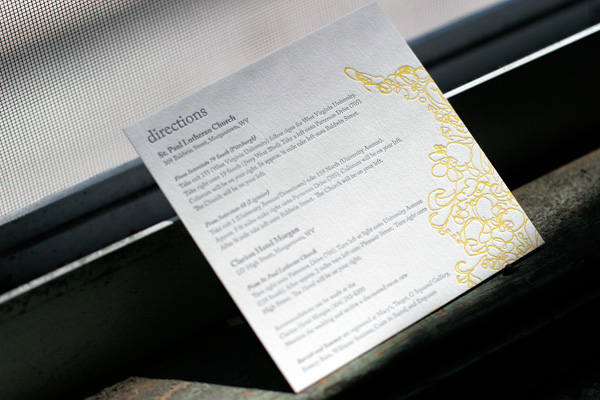
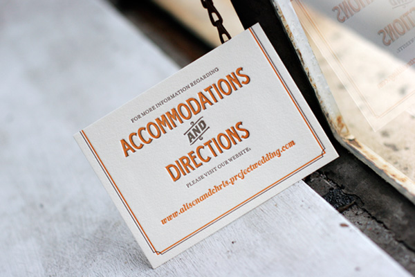
We thought we’d share a fun round up of some of the awesome letterpress directions and accommodations cards we’ve printed in recent months. Some of them include maps and other details and some of them simply refer guests to a website with lots of extra information to make their travel easier. Accommodations cards are especially helpful if you’ve negotiated group rates at local hotels so guests know where to book their room. Check out these ideas for tons of great letterpress inspiration!
 {Letterpress directions card in Flourish.}

{Tara accommodations + directions website card.}
 {Tennyson letterpress directions card.}
 {Directions card in Tuileries.}
(more…)


